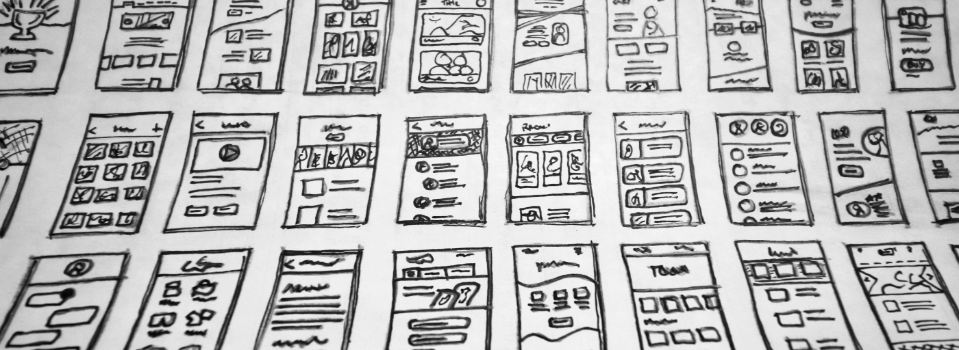
A landing page has one job: to convert visitors into leads or customers. Unlike a full website, which serves multiple purposes, a landing page should be focused, intentional, and distraction-free.
Yet many small business landing pages fail because they try to do too much at once. Too many messages, too many options, and not enough clarity often result in lost opportunities.
In 2026, attention spans are shorter, competition is higher, and users expect instant clarity. A high-converting landing page is no longer a “nice to have”, it’s a core part of any successful digital strategy.
Here’s what separates an average landing page from one that consistently converts.
1. A Clear and Compelling Headline
Your headline is the first thing visitors see, and it determines whether they stay or leave.
A high-converting landing page uses a headline that is:
- Clear
- Benefit-driven
- Specific
- Relevant to the visitor’s intent
Instead of vague statements, strong headlines communicate value immediately.
Visitors should understand within seconds what you offer and why it matters to them. If they have to interpret or guess, you’ve already lost momentum.
2. A Strong Supporting Subheadline
The subheadline expands on the promise made in your headline.
It should:
- Reinforce the main benefit
- Add clarity or context
- Reduce uncertainty
- Encourage continued reading
This is where you bridge the gap between attention and interest.
A good subheadline doesn’t repeat the headline, it strengthens it.
3. A Focused Value Proposition
Your landing page should clearly answer one question:
Why should someone choose you?
A strong value proposition explains:
- What you offer
- Who it’s for
- What problem it solves
- Why it’s better or different
Many landing pages fail because they focus on features instead of outcomes.
People don’t buy services, they buy results.
4. A Single, Clear Call-to-Action (CTA)
One of the most common conversion killers is choice overload.
A high-converting landing page focuses on a single primary action, such as:
- “Get a Quote”
- “Book a Consultation”
- “Download the Guide”
- “Start Your Project”
The CTA should be:
- Visually prominent
- Repeated strategically throughout the page
- Easy to understand
- Action-oriented
Every element on the page should support this one goal.
If users have to think about what to do next, conversions drop.
5. A Logical Page Structure
A high-converting landing page follows a natural flow that guides users through a decision-making journey.
A typical structure includes:
- Headline and subheadline
- Value proposition
- Benefits
- Social proof
- Supporting information
- CTA
This structure mirrors how users naturally process information:
What is it?
Why should I care?
Can I trust it?
What do I do next?
A confusing structure disrupts this flow and reduces conversions.
6. Benefit-Focused Content
Visitors don’t care about features until they understand the benefits.
Instead of saying:
- “We use advanced design tools”
Say:
- “We create websites that convert more visitors into customers”
Instead of:
- “Fast-loading pages”
Say:
- “Keep visitors engaged and reduce bounce rates”
High-converting landing pages translate everything into outcomes that matter to the customer.
7. Trust Signals That Reduce Risk
People rarely convert without trust.
A strong landing page includes credibility indicators such as:
- Testimonials
- Case studies
- Client logos
- Reviews
- Certifications
- Before-and-after results
These elements reduce perceived risk and reassure visitors they are making the right decision.
Without trust, even the best offer will struggle to convert.
8. Visual Hierarchy That Guides Attention
Good landing pages don’t overwhelm users—they guide them.
This is achieved through:
- Clear headings and subheadings
- Strategic use of spacing
- Contrasting CTA buttons
- Consistent typography
- Highlighted key points
Visual hierarchy ensures users naturally move toward the most important actions without confusion.
If everything looks equally important, nothing stands out.
9. Minimal Distractions
A landing page should eliminate anything that doesn’t support conversion.
That means removing or reducing:
- Excess navigation links
- Competing offers
- Unnecessary information
- Distracting animations
- Irrelevant content
Every additional distraction gives users another reason to leave.
Focus increases conversions. Simplicity drives results.
10. Mobile-Optimised Experience
Today, most users will interact with landing pages on mobile devices first.
A high-converting landing page ensures:
- Fast load times
- Easy-to-read text
- Thumb-friendly buttons
- Clean vertical layout
- Simple forms
If the mobile experience is frustrating, conversions will suffer, no matter how good the desktop version is.
11. Short, Frictionless Forms
Forms are often the final step before conversion and, the point where many users drop off.
High-performing landing pages reduce friction by:
- Asking only for essential information
- Avoiding unnecessary fields
- Using clear labels
- Making forms visually simple
The easier it is to complete the form, the more conversions you will get.
12. A Strong Closing Section
The end of the page should reinforce the decision and remove final doubts.
This can include:
- A final CTA
- A short summary of benefits
- Additional testimonials
- A reassurance statement
The goal is to give users confidence to take action immediately rather than leaving to think about it later.
Conclusion
A high-converting landing page is not about flashy design or overwhelming content. It’s about clarity, structure, trust, and focus.
Every element should work together toward one goal: guiding the user to take action without confusion or hesitation.
When done correctly, even small improvements in messaging, layout, or usability can lead to significant increases in conversions.
In a competitive digital landscape, the difference between a landing page that performs and one that fails often comes down to how well it answers a simple question for the visitor:
“Is this the right solution for me and, what should I do next?”